- Role
- Graphic design: composition, grid, typography and colour
- Type
- Client
- Year
- 2026
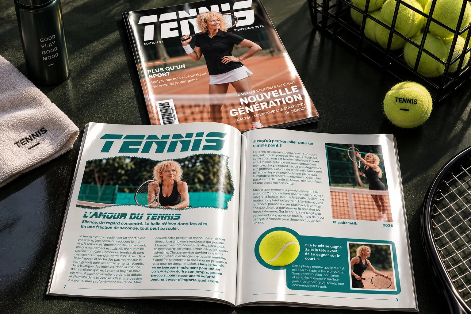
The cover and opening spread for issue 01 of a tennis magazine, from the client’s brief to the printed piece.
Context
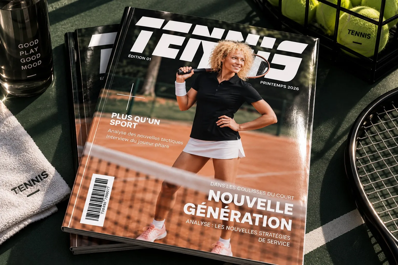
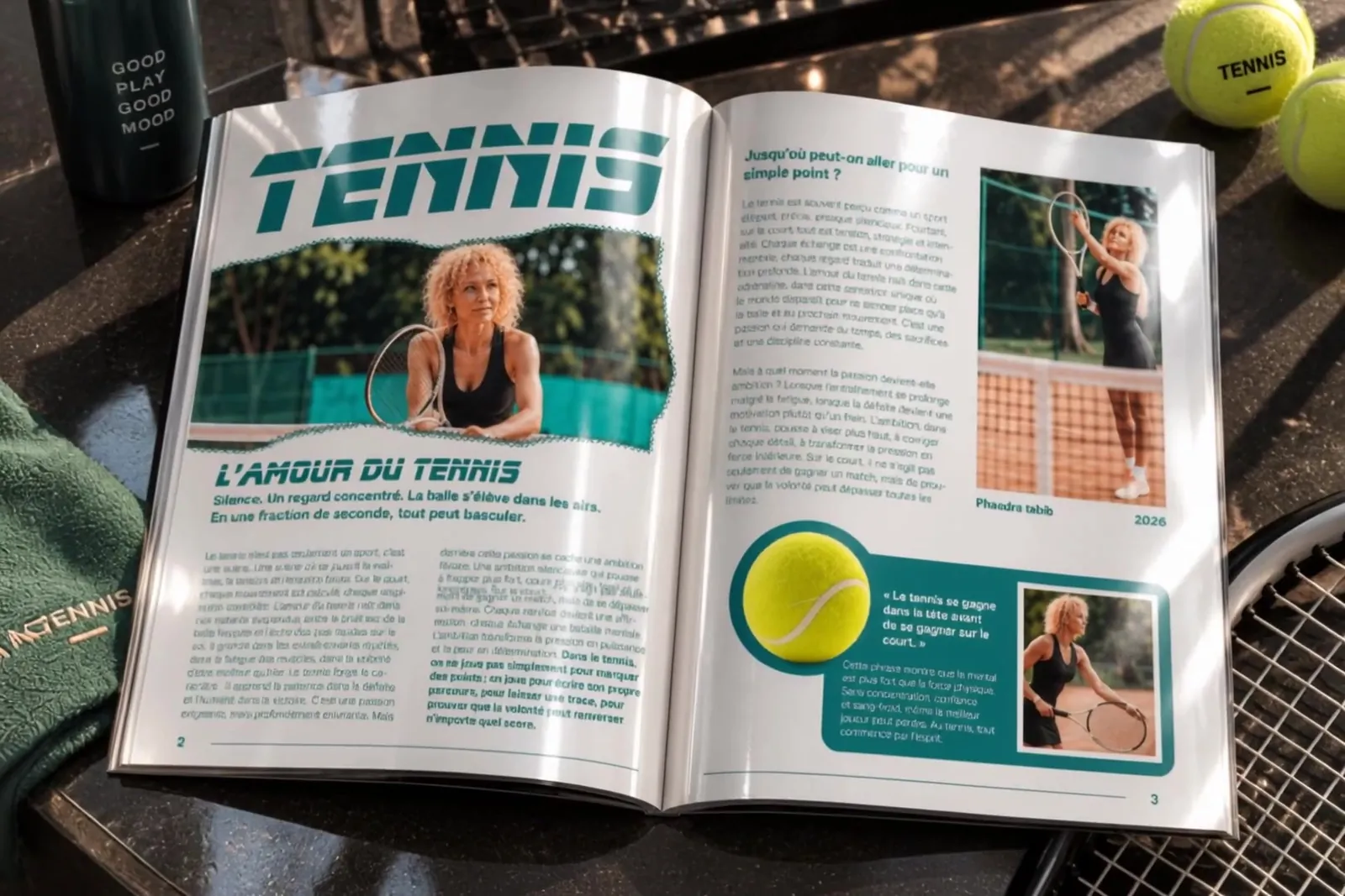
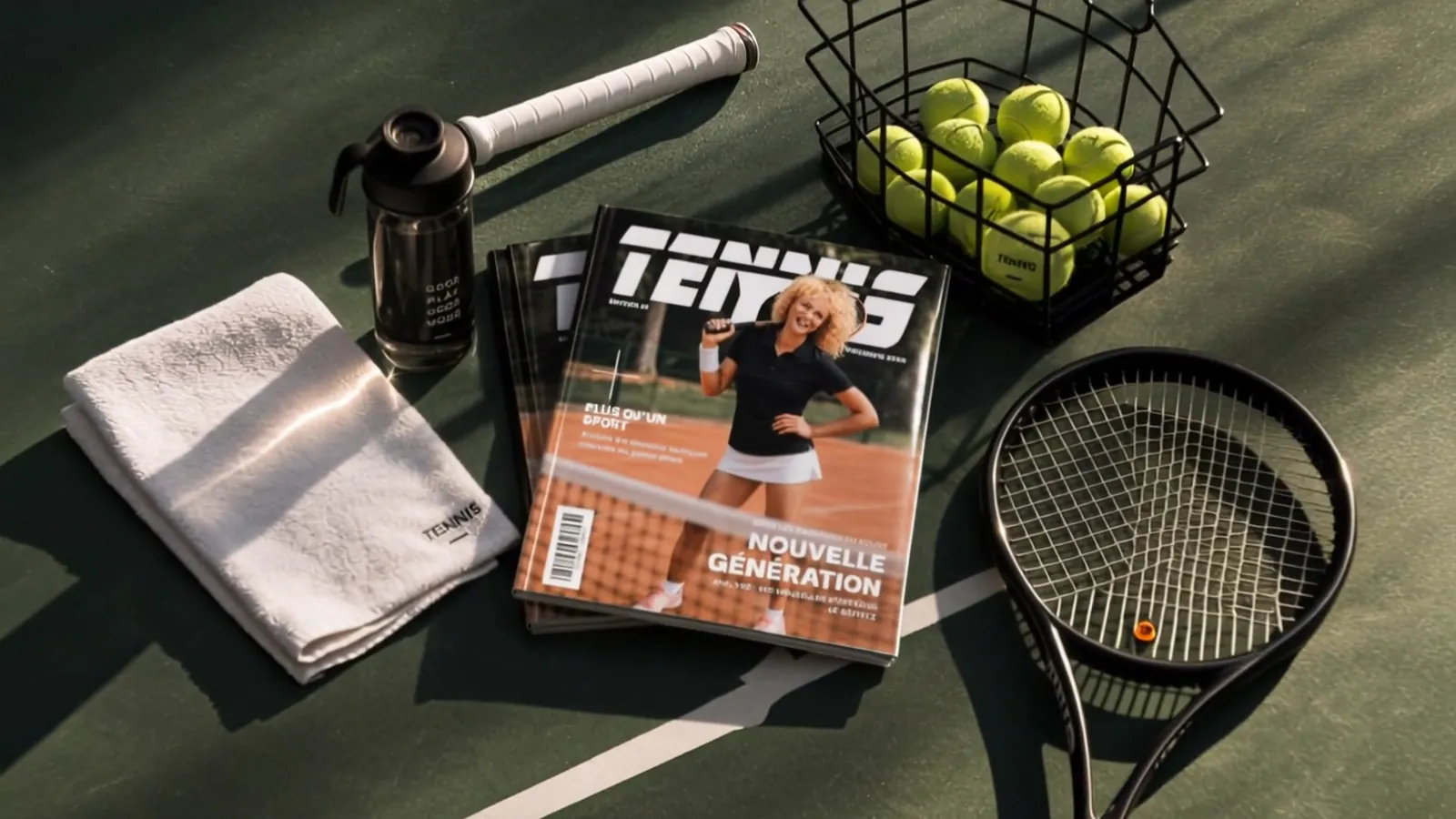
A company entrusted me with two key pieces of issue 01 of its tennis magazine: the cover and the opening spread. It wanted a cover that stands out, a sporty and elegant identity, and a spread that makes you want to read.
Concept
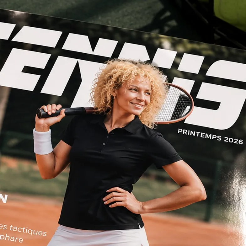
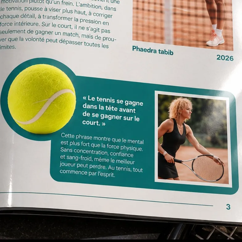
More than a sport: a stage. Conveying what is at stake behind every point: control, tension, raw emotion. An italic masthead cut on the slant for movement, a player stepping in front of the title for depth, portraits and a quote for emotion.
Logo, colours and type
A palette drawn from the court: the teal of the windscreens, the ochre of the clay, the yellow of the ball, on paper white. The masthead is set in extra-bold italic, and article headlines stay in the same family to tie the article to the brand.
Final result
A massive masthead and a cut-out player stepping in front of it: the cover has depth. A clear grid, a standfirst that hooks and a pulled quote: the spread sets the tone of the magazine.