- Role
- Art direction and graphic design
- Type
- School, La Cité
- Software
- InDesign, Illustrator
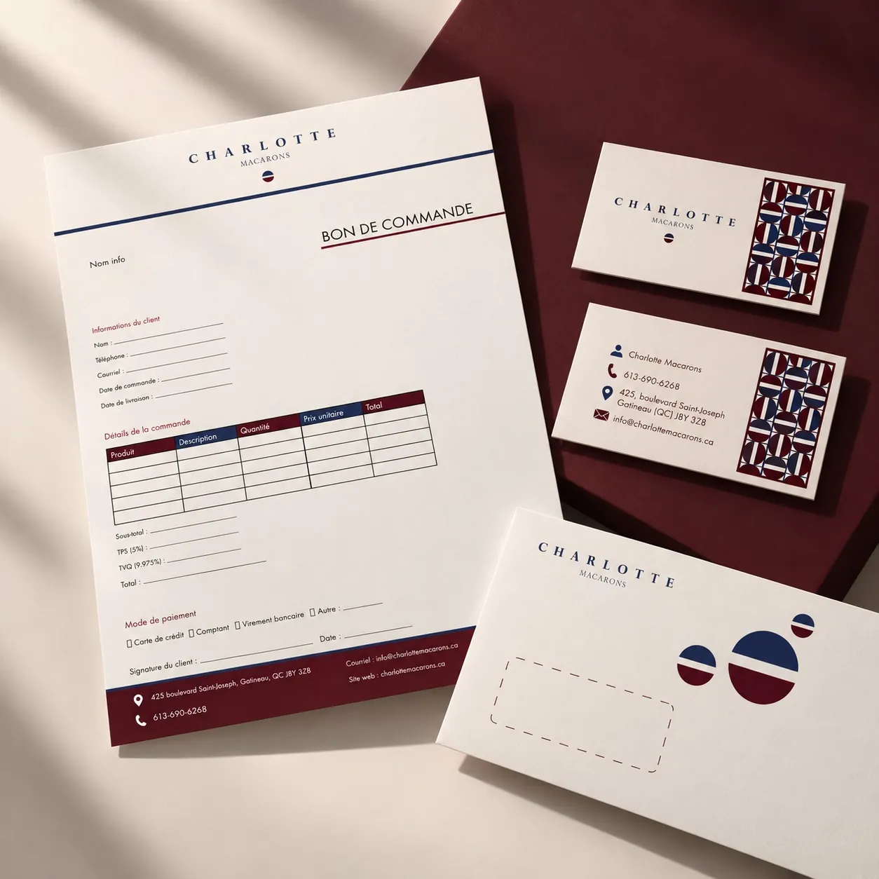
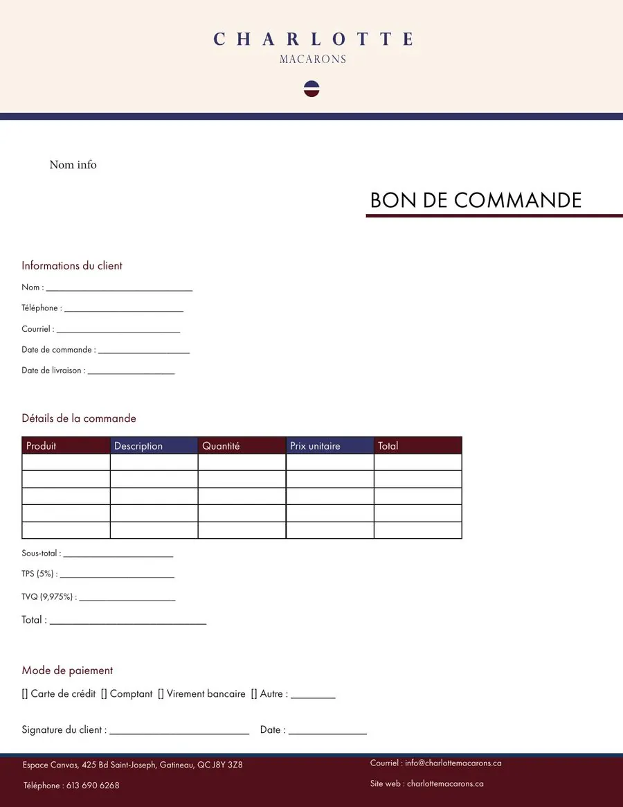
A stationery system for a macaron house in Gatineau: envelope, business card and letterhead. The elegance of a French maison, the indulgence of a macaron.
Context
The challenge: evoke high-end French pâtisserie on documents that must stay simple to use every day.
Concept
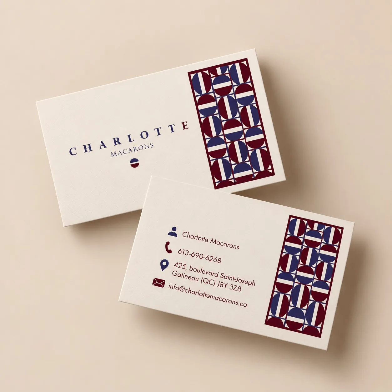
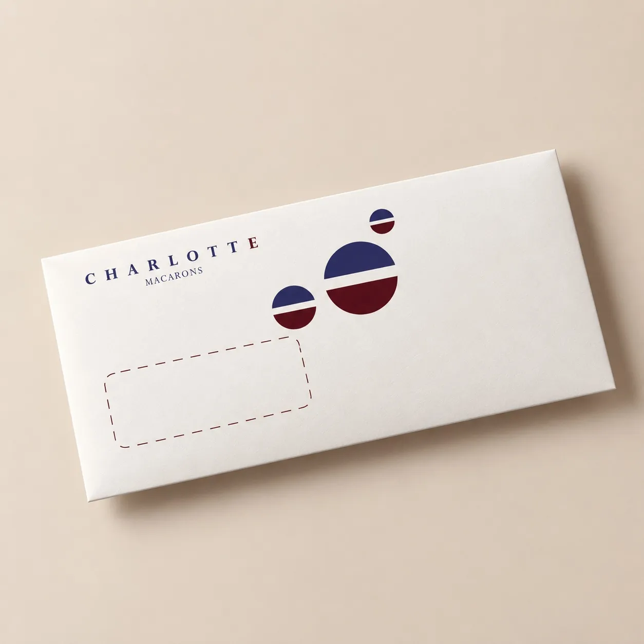
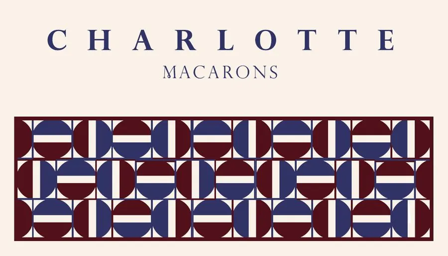
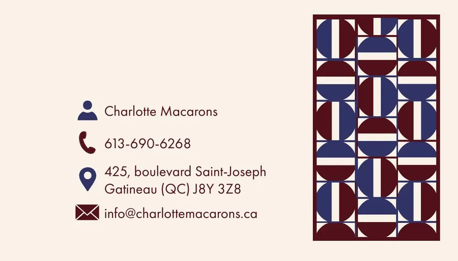
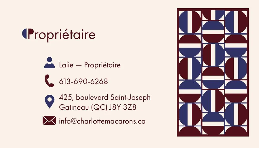
A single symbol, the macaron seen in profile, extended into a pattern. The top shell in night blue, the filling in white, the bottom shell in burgundy: the French tricolour, in a muted version.
Logo, colours and type
Three colours, not one more. Night blue for rigour and trust, cream for finesse, burgundy for indulgence and nobility. The name in spaced capitals, information in a clear sans, and plenty of white.
Final result
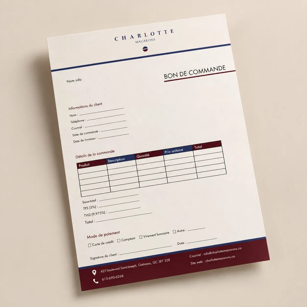
Each piece doses the logo, the symbol, the pattern and the burgundy differently: consistency comes from repeating four elements, not from a single layout.
Skill Swap
Brand identity and strategy