- Role
- Visual identity, packaging, persona, campaign visuals
- Type
- School, La Cité
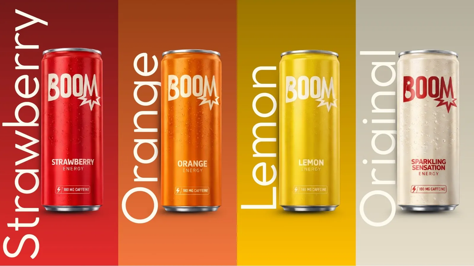
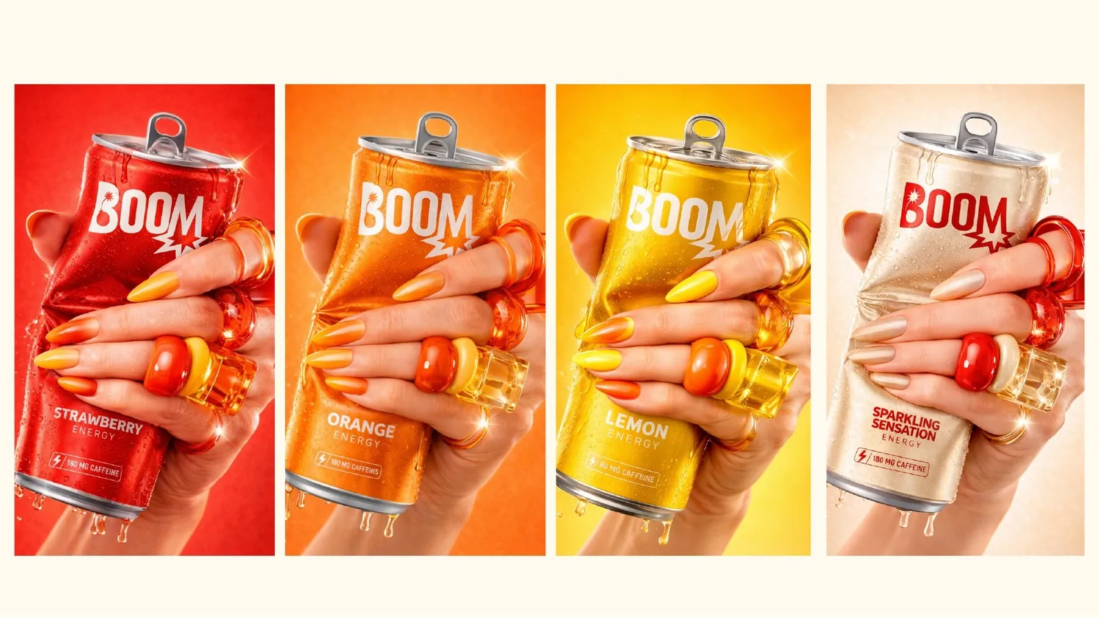
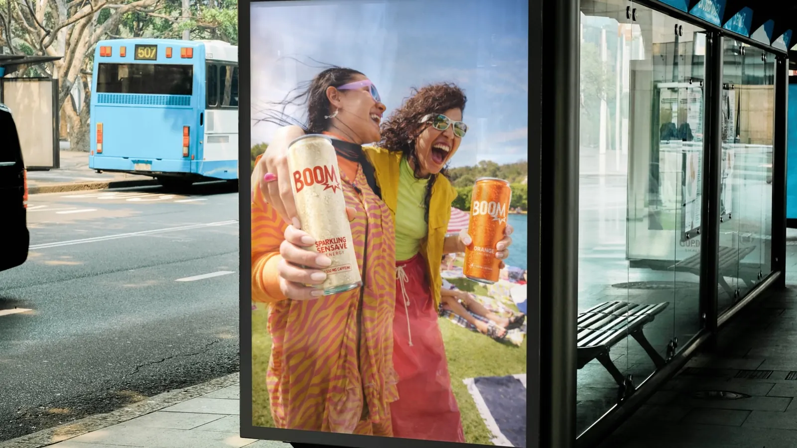
The complete creation of an energy drink: the name, the logo, four cans, a target customer and an outdoor campaign. You open it, you drink it, and BOOM, off you go.
Context
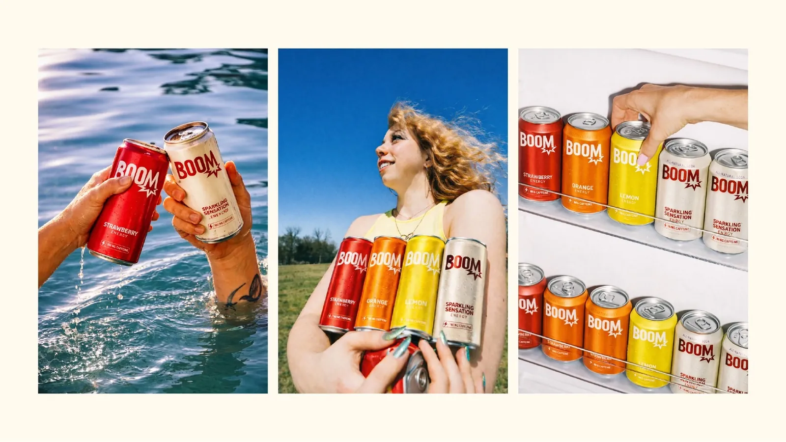
Today we all need a boost in our daily lives. But we no longer want just a drink that wakes us up: we want something pleasant to drink that feels like us. BOOM is a simple, effective energy drink with a real identity, in four flavours: Strawberry, Orange, Lemon and Original.
Research and inspiration
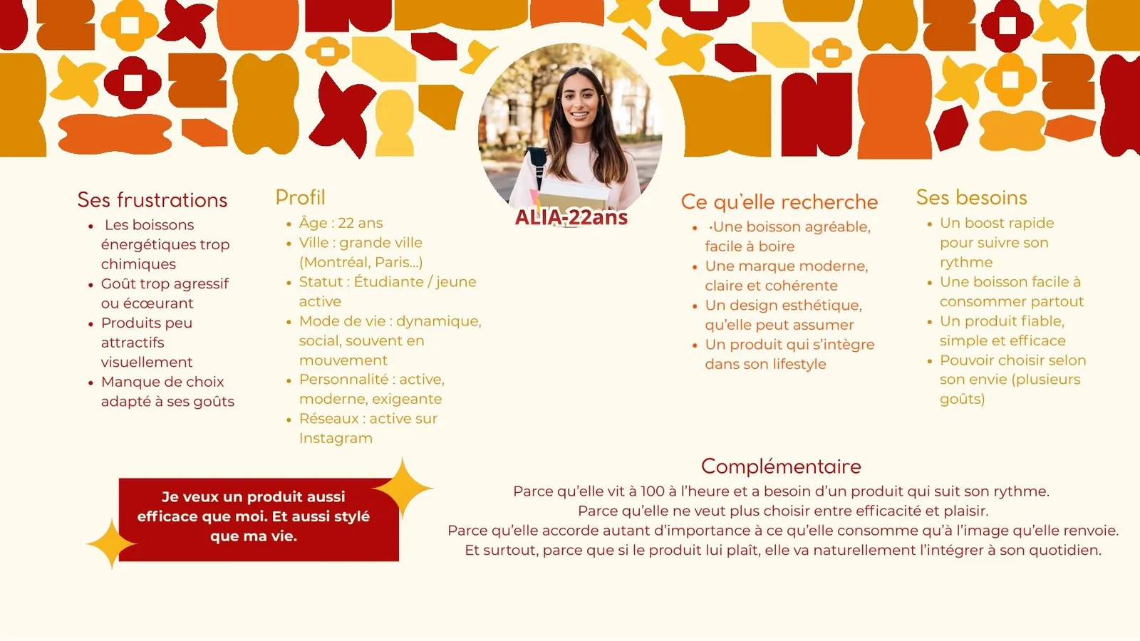
The target customer is Alia, 22, a student and young professional in a big city, very active on Instagram. She finds energy drinks too chemical, too aggressive and unattractive. She wants “a product as effective as I am, and as stylish as my life”.
Logo, colours and type
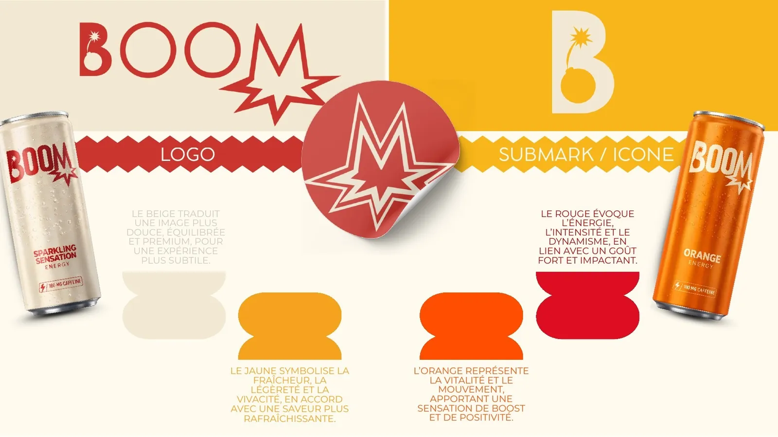
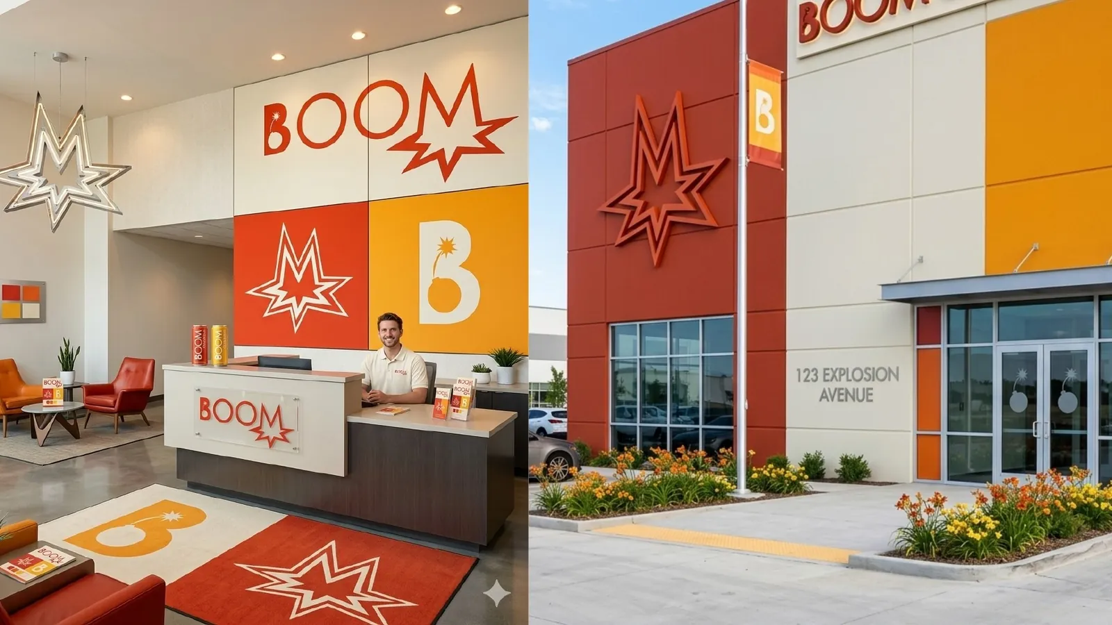
An explosive logo, a bomb tucked into the B and an impact star under the M, plus an icon for small formats. Red evokes energy and intensity, orange vitality and movement, yellow freshness and lightness, beige a softer, more premium image.
Final result
BOOM is more than an energy drink. It is a complete design project, where every element, from the logo to the colours and the cans, was designed to create a strong, consistent identity. BOOM is the balance between function and image.
Olympe
Creative exploration